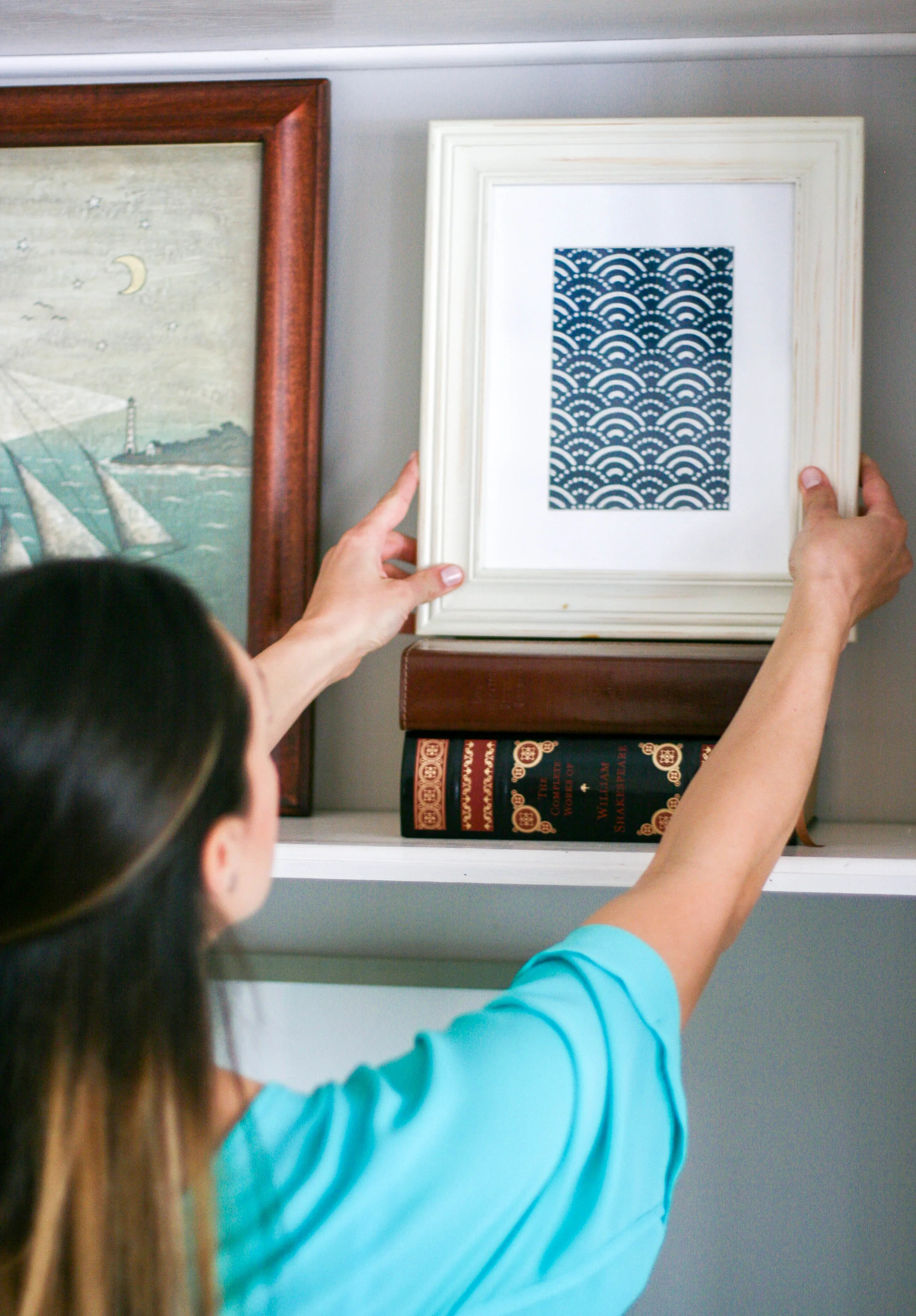
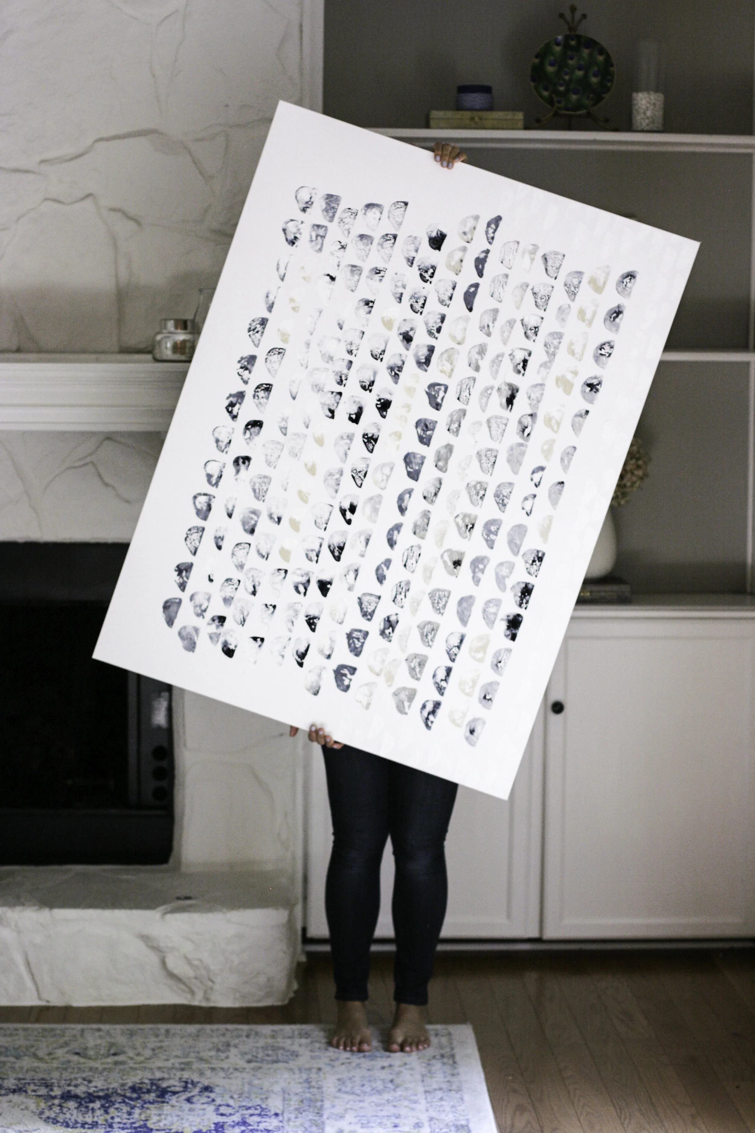
Potato Print Art DIY.

Art DIY5.jpg
Art DIY8.jpg
Art DIY4.jpg
Art DIY10.jpg
Art DIY7.jpg

Art DIY12.jpg
Art DIY13.jpg
Art DIY14.jpg

I found this Rebecca Atwood DIY on Emily Henderson's site over a year ago. I think Rebecca's work is phenomenal and was blown away with how Emily styled it just so magnificently. The more I thought about it, the more enamored I became with the way that you could tailor this kind of art to however you like - it's really so simple! Potato printing has been around a long time, and there are infinite ways that you can express yourself using potatoes as your stamp!

Supplies Needed:
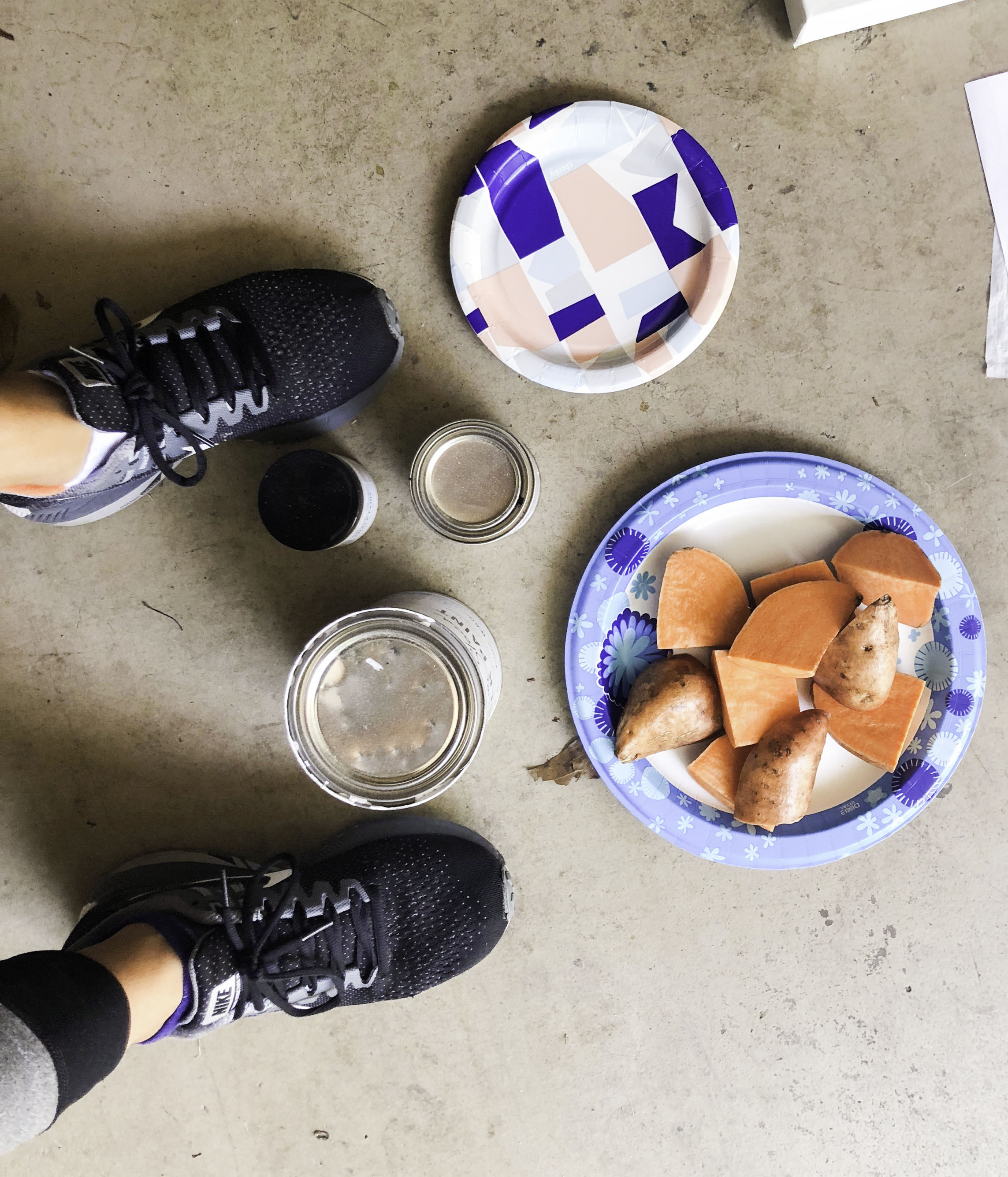
- a canvas (I grabbed a massive one on sale at Michael's!)
- 3 kinds of paint (or more!) I used Annie Sloan Chalk Paint in Pure White and Old Ochre, along with a simple black acrylic paint simply for mixing and adding depth
* I used the chalk paint because I wanted the crackled texture/effect when the paint dried, but if you are look for more of a smooth texture, definitely stick to an acrylic ;)
- 1 potato (I used a sweet potato!), to be used as the stamp, cut into half-moon shapes (I made about 6-7 stamps)
- a few paper plates for mixing the paint

Method:
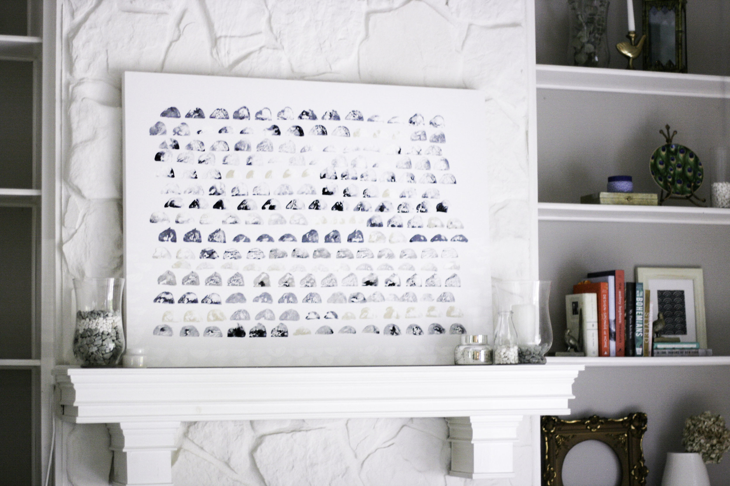
It's really a matter of touch with a piece like this. I used the 3 paint colors and mixed them in 6-7 different ways, then I assigned a different potato "half moon" stamp to each of the paints I mixed up. I am kind of a touch artist, so I don't do a lot of measuring when it comes to something like this, I just feel out the dimensions (this drives my husband crazy but its MY ART). So I eyed the width and length of the canvas and knew that I wanted to keep a thick white border around the paint, and started pressing the stamps (dipped in the paint) a few inches in. I just began pressing the stamps into the canvas, mixing up with paint and shapes with every few presses. I didn't dip each stamp into the paint every single time, because I wanted the effect of some being more bold and some being lighter for contrast.

I continued this process, standing up a lot to make sure my lines were straight (I actually like the bit of wiggle!), and making sure I was mixing up the shape of the half moons consistently.

I also decided to add a pure white "border" on the bottom of the piece, gently working my way up until fading it out at about half way. It's extremely subtle and hard to see in the photos, but I love the effect and it made it feel like "mine" this way.
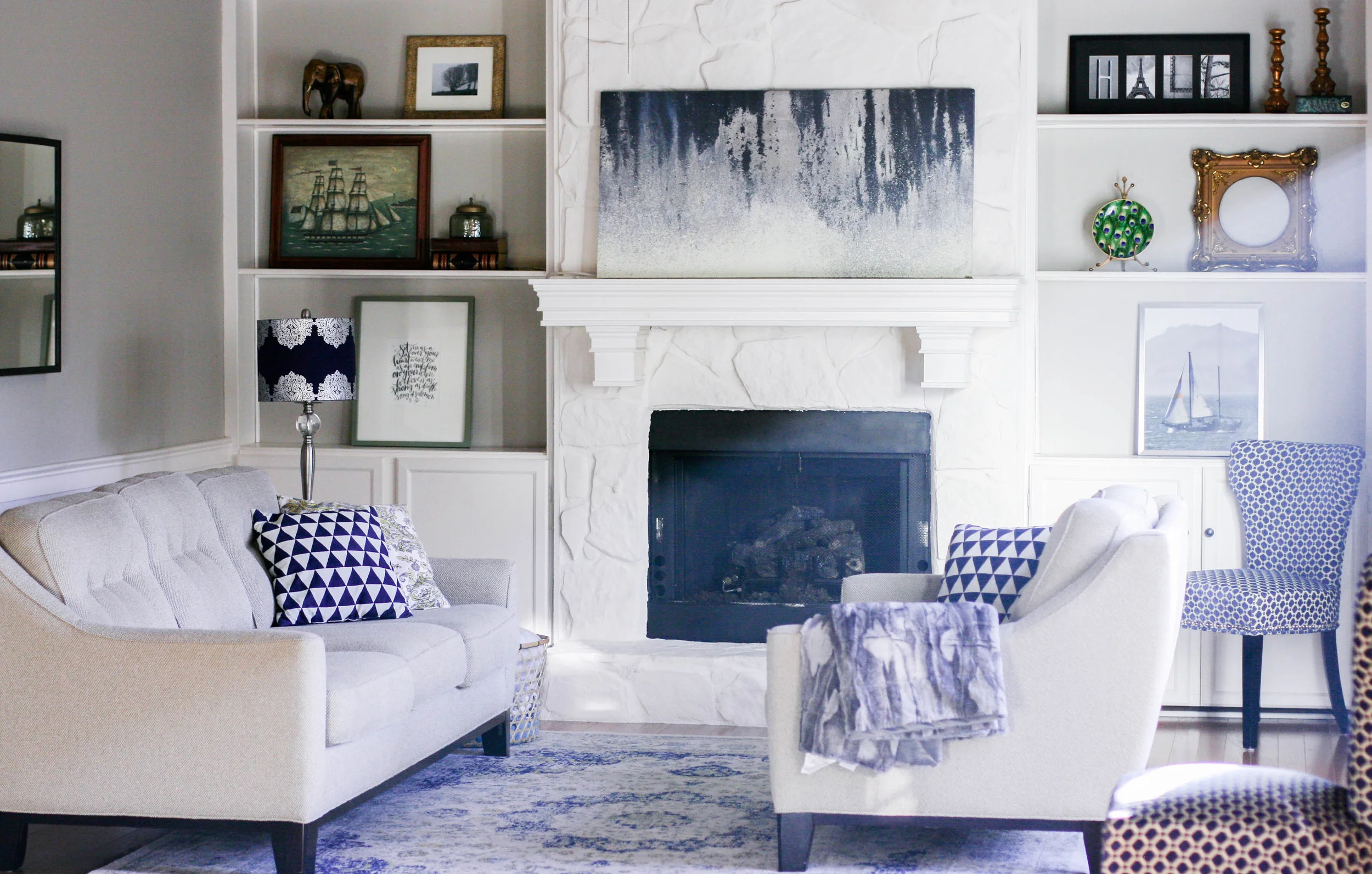
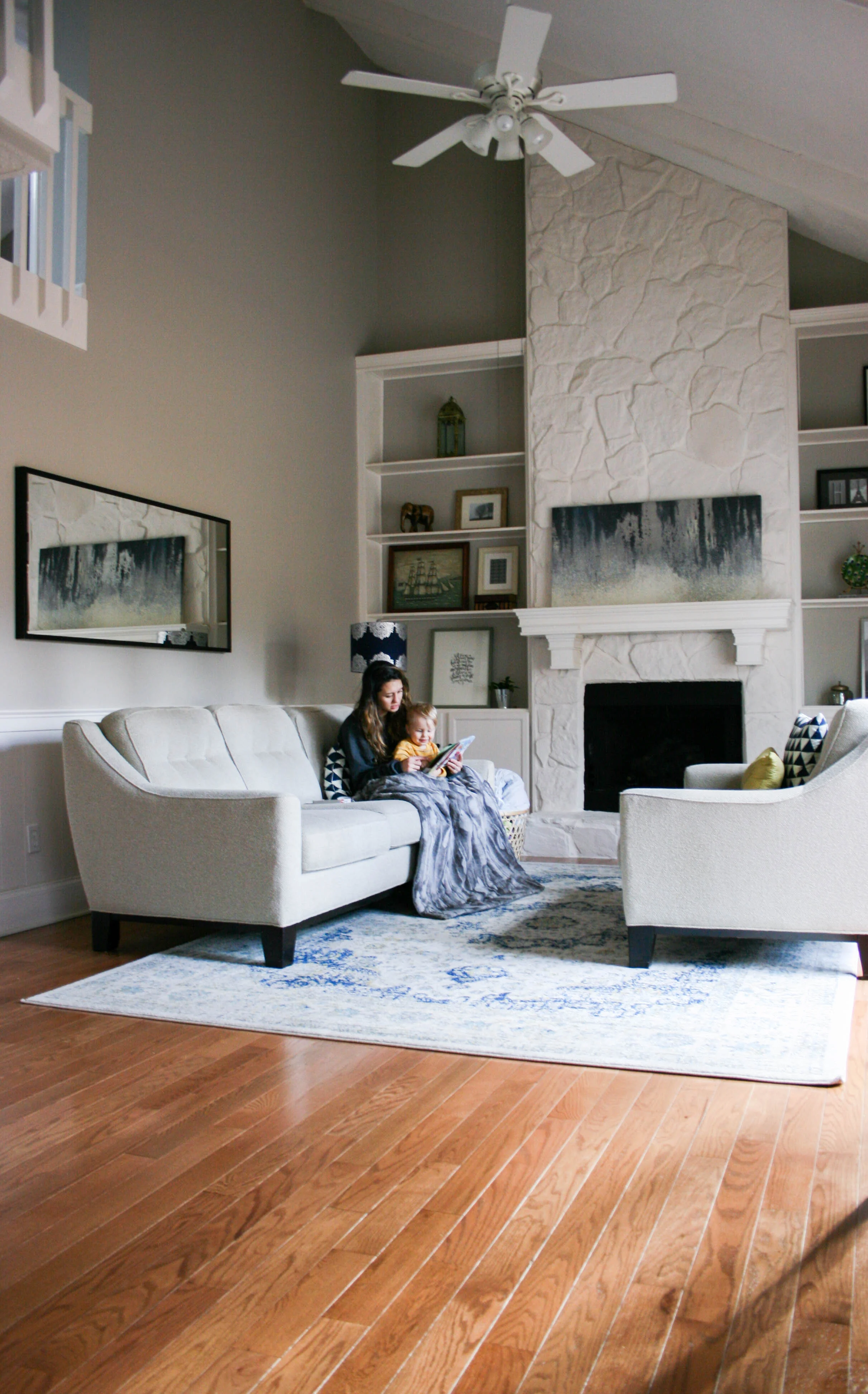
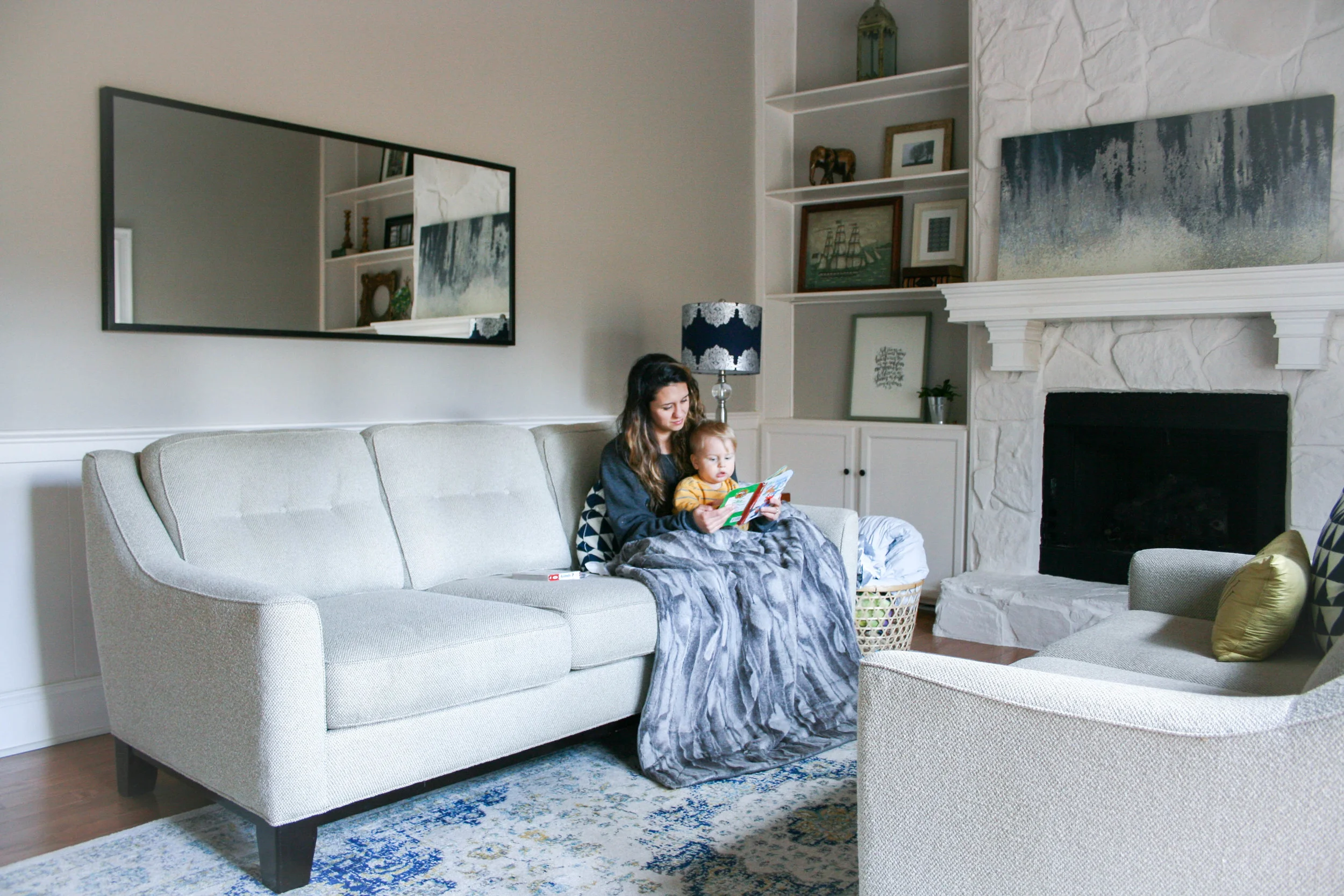
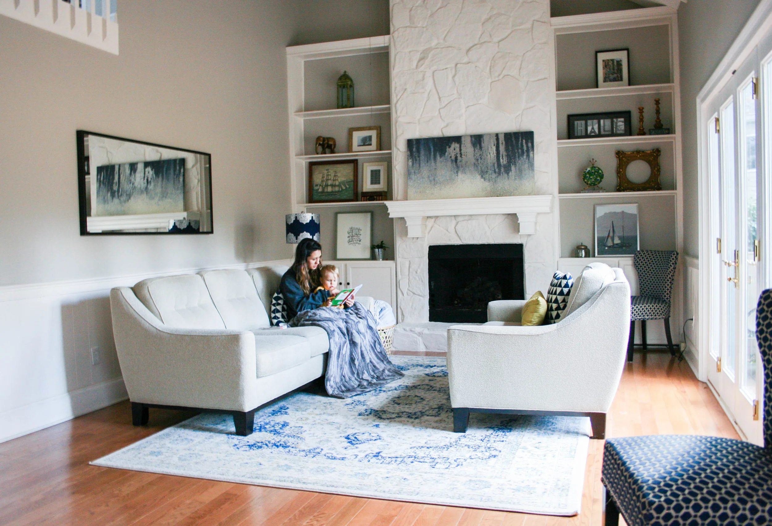
The Result.
This piece was extremely therapeutic for me to make. It was something that was in my heart for a long time, so actually doing it was kind of emotional. Don't laugh, but I actually cried through some of the process. I love how art (and using your hands to create it) can be so helpful in processing what is happening in your life. I personally have had a lot of up and down emotional experiences this summer, and this painting really helped me with some of my coping. And I didn't expect that! So this piece is extra special to me.

I planned for the piece to look more black and white, but the black ended up adding a blueish effect to the white paint. The ochre shade added a sandy tone, and along with the slight movement in the piece, the end work reminds me of the ocean. I love it! And this ended up looking more like the example then I expected! But I absolutely love the result and I am super proud with the uniqueness of this. I've been inspired to do it again, perhaps on a smaller canvas with a yellow/orange vertical style. And maybe using a different medium for the stamp!


Art DIY9.jpg
Art DIY11.jpg

I'd love to hear your thoughts on this DIY! Is this something you would be up for trying? What kind of DIYs are you interested in learning more about? Let me know in the comments below!

Upcycled Buffet Table.

When we moved into our house a little over a year ago, we were given a set of dining room furniture. Yes, given. An entire set of furniture. We were crazy blessed, considering we had no furniture to our name at the time. While the furniture was extremely well-made and in mint condition, it was a little old-fashioned for my taste. Visions of DIY projects filled my dreams, and I had grand plans to flip this furniture and give it a shabby-chic makeover. Little did I factor in the 40+ other home improvement projects, a husband in and out of town with his job, and getting knocked up again into that plan. Those things shifted the priority list, and for over a year I stared at this furniture day in and day out, as it towered over me with its mahogany ferociousness.

It seems like it would have a frenchy accent, right?

I would like to say there's a happy ending to this story, but I'm still mid-story. I managed to finish re-doing the dining room buffet before this little guy arrived, and I am so thrilled with how it turned out. However, I still have a gigantic china cabinet and dining room table to finish... so I'm about 1/3 done with the set. But still! Progress!

Here is the "before":

Here is the piece with 1 coat of paint:

And here is the piece with 2 coats of paint:

And here is the "after":

The Process.
To achieve the antique look, I used Annie Sloan Chalk Paint in Pure White. I applied two coats of the paint, using Purdy 1.5 and 3-inch brushes, letting the coats dry for a few days in between. Using a course grade of sand paper, I sanded the areas I wanted to distress, especially the decorative flourishes in the wood. I wanted those to stand out, so I really went to town on those sections. (If I were doing this project again, I would use an electric sander because this part was very labor-intensive).

Then I used the Minwax Wood Finishing Penetrating Stain in Ebony and gently applied it to the entire piece. I used an extremely minimal amount, and even then, I worked in small sections, applying the stain with an old rag and then immediately wiping it off. I used gloves for this part. I found that using the Annie Sloan Clear Wax to wipe off the stain was the perfect way to minimize the intensity of the stain while still letting the pigment soak into the sanded areas. So I went back and forth with two rags, applying the stain, and then rubbing the stain off with the clear wax. This process was the most artistic part of the whole project, because I could decide how dark/light I wanted the stain to look and soak into the wood. The more stain you use, the more distressed and aged the piece looks. The less stain you use, the brighter the white paint looks. So it's definitely a choice. I spent a lot of time pouring over Pinterest DIY projects (check out my dining room board) to figure out how I wanted my piece to look.

I finished the buffet with another coat of clear wax over the entire piece, to seal everything. Then I spray painted the hardware with Rust-Oleum Metallic spray paint in Oil Rubbed Bronze. Overall, I am super pleased with the buffet and I feel like achieved that french provincial look I was going for.

I chose to keep the top of the buffet the original wood, because there was a decorative feature in the grain that I think is super artistic and beautiful. I think the dark wood on top anchors the piece and keeps it feeling "dressy". I decided to move the furniture out of my dining room because it was simply too crowded in there. Now it lives in the living room, and I use it as a bar when we have guests over.


Project Cost:

Buffet - FREE
Hardware - FREE (kept the old)
Purdy 1 + 1/2-inch Paint Brush - $9.86
Purdy 3-inch Paint Brush - $15.33
Annie Sloan Chalk Paint in Pure White - $34.95
Annie Sloan Clear Wax - $24.95
Minwax Wood Finishing Penetrating Stain in Ebony - $11.00
Rust-Oleum Metallic spray paint in Oil Rubbed Bronze - $7.77

Total Cost: $103.86

I can't give an exact estimate of how long a project like this should take, because I took a month-long trip to New York in between starting and finishing. Oops. Talking about procrastinating. So in theory, this should probably take 5-7 days total, including the drying time, but it took me all summer long to actually get this thing moved back into my home.


Overall, I am really pleased with this furniture makeover. Now I just need to have a paint party to complete the rest of the dining room furniture! Who wants to come over?? I'll buy the pizza and brew ;)

P.S. - When I painted my son's toy cabinet emerald green, and if you're up for braving it, how to make your own chalk paint.

6 Easy Tips for Styling Your Built Ins.

A few weeks ago I shared a peek at our living room and the concept that went into the design. In my opinion, the things that really "make" this room are the high ceilings, the built-in shelves and the natural lighting. None of that really has to do with the decor. But those elements certainly enhance the decor and showcase its best qualities! I am a bargain shopper and don't really have a lofty budget to spend on home decorating. So I've combined a lot of items that were given to me or that I picked up inexpensively (some of them, literally, for free on the street!) Today I want to share my 6 tips for how to style built-in shelves easily and inexpensively.

1. Only Use a Few Items.
You know what you will love the very most about your shelves? How clean they look. It's really important to use less items than you think you need on those shelves. Trust me - this is what will keep them looking fresh and chic. Only use a few items! Between 1-3 for each shelf.

2. Keep the color palette complimentary - and neutral.
Pick a few shades that are represented in the room and stick to those tones. Your eyes will thank me. Because you will have so many different objects to look at, it's best to keep things in the family of neutral, with a hint of a color pop here and there. Use the colors already found in your room. In my case, I used a recurring theme of gold and silver elements, with lots of white space. Then I added a few pops of color, which coordinated with other colors in the room. The black frames coordinated with the black fireplace, the blue pictures coordinated with the main art piece and the rug, and the random pops of color came in the form of my green peacock-inspired plate and the wooden elephant.

3. Use different textures.
Using an array of textures on your built-ins is what makes the uniform palette come to life. Though the colors may play it safe, the types of objects and the different textures create enough intention to keep your eye interested for a while. For this reason, I mixed the elements and included glass, wood, live plants, framed fabric, books, etc. to create dimension on the shelves.

4. Include things you want to look at.
This might seem silly, but its not. So often, we can look at others' homes or flip through books (or watch HGTV) and think that the way someone else does something is the right way. But if we try to replicate that same look, it might not feel natural. It's important to use others' experiences as a launching point for inspiration, but make sure that everything you personally use in your home, especially on your built-in, that you completely love. Because at the end of the day, it's not a designer looking at your shelves everyday, it's you and your family. Make sure you love each of those items and want to look at them.

5. Consider the Scale.
In this case, the scale really matters. If your book shelves are enormous, you are going to want to use larger items to fill that space. Using tiny items in a big space can make the shelves look cluttered, which is the opposite effect you want to have. Make sure to choose varying sizes and shapes of items that fit to the scale of the shelves.

6. Never finish.
The most important (and often most frustrating) part of home decor is the journey: it's always a work in progress. But instead of letting this get you down, treat it like an exciting journey. There is always something inspiring on the horizon! Keep an eye out for items that you want to trade in and out on your built-ins. It will keep the scene fresh and hopefully keep your inspiration hat on. I am often walking books down stair and pictures upstairs, swapping their position in the house and finding where something feels "final". That almost never happens, but I like to put items somewhere on display for three months or so, then move it again, until it finally feels done. Let yourself enjoy the journey!

Thanks for reading! For more information about the items in this room, you can check the Living Room Home Tour post.

Home Tour: Living Room.

I'm so excited to share this space with you today! Since we bought our first home and moved in this past summer, we have been buying, returning and rearranging the furniture in our place to make the space our own. Sometimes it takes a minute. Over Christmas I rearranged everything again and it finally feels like we are using this space for the reasons we like. And it feels so good :) You know, like home.

Goals for this room:
We wanted this space to feel clean, open and uncluttered. I love the built-in shelves and the painted fireplace. We purposely didn't put our TV in this room for a few reasons. First, it's open to the kitchen and I knew I would have it on all the time while I was cooking if I had that option. I love to cook alongside Giada. Second, I really wanted this room to feel like a family space, where we hang out by the fire (when Everett is asleep), where we read, work on our laptops, take naps, and stare at our yard through the french doors. I wanted to enjoy the natural light and the high ceilings. I wanted this space to be kind of dreamy and peaceful. And it really, truly feels that way now.

We all love this room for it's non-TV purposes. Everett has a big bin of toys alongside the love seat (tucked away so it's not an eyesore), so he is constantly dragging them out all over the floor and playing on the big cozy rug (which we got on crazy sale via Rugs USA, you have to check them out!) He also loves to stare out the window at all the birds in the yard. Have I told you about all the birds in my yard? I love birds. I need a bird passport.

Stevie loves to steal a corner of the couch early in the morning to read his bible. Along with a steaming mug of any kind of tea. This is his favorite way to get the work day started, with some peace and quiet and Proverbs.

I love to read in here, too, though I wish I were doing more of it. When I let myself, this is where I will stretch out for a 20-minute snooze.

What you see:
Couches: Bought with the house, and I really can't find a tag to indicate the brand, sorry!
Rug: Rugs USA
Art Print (above the fireplace): Target
Chairs: Home Goods
Pillows: Ross and Target
Blanket: Target
Mirror: IKEA
Lamp: Gifted

On the Built In Shelves:
On the left:
Art Print: Jenny Highsmith
Plant: Winter Cactus
Framed Fabric: Minted
Framed Ship Print: Jay Zinn Art
Carved Elephant from Kenya
Lantern: Home Goods

On the right:
Sailboat Photo: Stevie took in San Francisco
Gold Frame (without picture): Found on the sidewalk in New York. Such a good day to find someone else's trash :)
Peacock Plate: T.J. Maxx
Candlesticks: Gifted
Custom Name Print: One Magnolia Lane
Top Photo: Stevie took in Venice :)

This room makes me so happy. In fact, it's my favorite room in the house (which is why I wanted to share it first). We still have much, much more to do in our home, but who doesn't? It's such a process. Once we actually finish making everything the way we love it, it will probably be time to move again. Happy Monday, friends!

Upcycled Living Room Toy Cabinet.

Kelly Green Toy Cabinet

This is perhaps my favorite upcycled piece I've ever done. I was given an old TV cabinet in the slew of free furniture we were given when we moved, and I knew I wanted to turn it into a storage space for Everett's toys in our entertainment room. This actually belonged to my elementary school librarian, Ms. Olham, and was given to someone else, who then gave it to us, so this particular piece of furniture actually has a bit of sentimental value. I was kind of a book nerd, and spent a lot of time in the library as a kid, so I knew I wanted to keep this piece and make it something special. Because of it's largeness and depth, Stevie wasn't sure it would work in the entertainment room, but I knew I had to find a way to make it work. Because, Mrs. Oldham! As I brainstormed about what I wanted for this piece, I was feeling so inspired by the rich shade of Kelly green. I couldn't shake it. So I went with it! Our entertainment room has taken on a vivid, bohemian vibe, and I can't wait to share photos of the entire space once I'm finally finished with it. This piece is one of the centerpieces of the room and I am so so thrilled with how it turned out.

Here is the before:

As you can see, the piece was a lovely mohaghany cabinet with brassy hardware, but it felt a bit bulky and dated. Since I had some success with chalky paint on my bedroom furniture, I decided to tackle this one with the same approach. But this time - I made my own chalky paint! I will share how incredibly easy it is next week on the blog. But trust me - you will never want to pay high dollar for chalk paint again.

It's a little challenging to capture the exact color, but I chose Behr Balsam, a flat interior/exterior paint. And I managed to cover this entire cabinet with just one sample size! Hello, savings. I love you.

After the first coat, things were looking a bit streaky and turquoise-y. I chose not to be fearful.

After the second coat, things were looking extremely matte and, well, bright. Like Sesame Street bright. Much brighter than I had expected. Again, I chose not to question the color choice. I knew I could tone it down in the steps to come.

The inside remained mahogany. Isn't it sort of sad looking? We will get to that in a minute.

Next I sanded the furniture using an extremely course sand paper, 80 grit. I focused on all the edges, crevices, and hardware. Then I just kept going and sanded the surfaces as well, wearing it down to expose the brown underneath in some areas. Just for fun. Because who doesn't like beating stuff up?

Then I decided to get a little crazy. Okay, crazier than painting a cabinet green. I grabbed another paint sample that I had chosen on a whim while I was at Home Depot, one that I had literally no plan for and just bought because I thought it was so pretty... and decided, what the heck? I'll coat the inside of the cabinet with this sapphire-esque blue! Because apparently I am turning my entertainment room into an arabian bazaar. So Behr Indigo Batik coated the inside of the cabinet. And my soul rejoiced.

Rejoice, oh soul. Rejoice.

Then things got really crafty. I used this Varathane Wood Stain in Kona to tone down the shade of the green and give the furniture an antique effect. There are a lot of antiquing waxes on the market, but this was by far the least expensive way to achieve the same effect. I used an old cut up tee shirt to rub on the stain in small sections, then I immediately wiped it off. The stain really soaked into the edges and crevices that I had sanded down, and made the whole piece look like it had been living in the dark corner of an a genie's lair for like a thousand years. Mission, accomplished.

Yum. I couldn't be happier with the finished product.

After the stain dried, I coated the entire piece with Valspar's Chalky Finish Sealing Wax. This protects the paint, so that it doesn't further chip, and also gives it a nice matte sheen.

And there you have it! Everett's toy mecca in our entertainment room. I love the piece so much. I'll admit that my original plan was for the piece to look a bit darker and more Kelly green, but you never quite know how a color is going to turn out until you just go for it. I still love this shade and it's the perfect pop of color for the room. The total cost for this DIY? About $7 for the two paint samples. And that's rounding up. I had the wood stain and sealing wax already, and paid nothing for the furniture itself.

This has become the place to store all of Everett's toys and keeps them out of sight when we want the room to look clean. And he loves toddling over to his cabinet, throwing open both of the doors, and seeing all his stuffed animals and balls and trucks. I'll try to capture his expression soon so you can see it - it's so stinking darling. He loves and I love it and we are all happy in our bohemian living space.

So what do you think? Have you tried using chalky paint to refresh a piece of furniture before?